Investing Newsletter 9.23
August 2023 Economy, Markets & Policy Update
The economy
Inflation and the economy were stable in August.
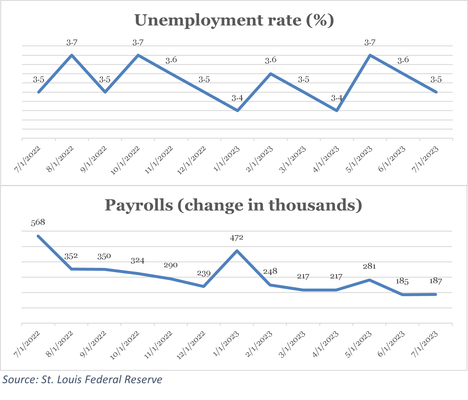
For the second straight month the unemployment rate declined and has now been below 4 percent for 18 straight months. [1]
Payrolls (new jobs added), meanwhile, were roughly unchanged from a downwardly revised June figure. Relatedly, job vacancies (openings) fell to their lowest level in over two years, and the “quits’ rate,” the number of voluntary separations as a percentage of the labor force, declined to pre-COVID levels. Vacancies and quits point to a reduction in job-market pressure, while payroll growth has slowed but remains strong.
CLICK ON CHART TO VIEW LARGER IMAGE
Conventional economic models link the jobs market with inflation through wages: lower unemployment pushes wages, then prices, higher. In the last three months, average hourly earnings have increased at an annualized rate of nearly 5 percent. By this measure, underlying inflation remains high compared to the Federal Reserve’s (Fed’s) 2 percent target despite some signs of ebbing labor market strain.
Labor markets are somewhat backward looking—they reflect the decisions of companies made months ago. More current measures of economic activity in the manufacturing sector confirm ongoing strong growth.
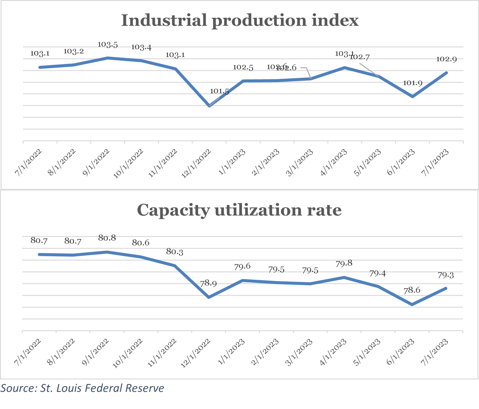
Industrial production picked up, and intensity of resource use (capacity utilization) increased during the month. These coincident measures point to stable economic activity.
CLICK ON CHART TO VIEW LARGER IMAGE
This conclusion is confirmed by real-time measures of the growth in real (after inflation) gross domestic product (GDP). The Federal Reserve Bank of Atlanta’s “GDPNow” estimates GDP growth for the current quarter (ending September 30) using publicly available economic data. Its most recent estimate is over 5 percent. [2]
If realized, this rate would be the biggest jump in GDP quarter-over-quarter since late 2021. GDPNow’s forecasts are subject to large uncertainty, however. Moreover, last quarter’s GDP growth rate was revised down slightly, to 2.1 percent annualized from a 2.4 percent annualized initial estimate. Since GDP is quite “persistent” in the short-term, this revision should temper expectations for the third quarter. Because inflation is associated with economic overheating, a more subdued pace of growth might help to ensure continued moderation in inflation.
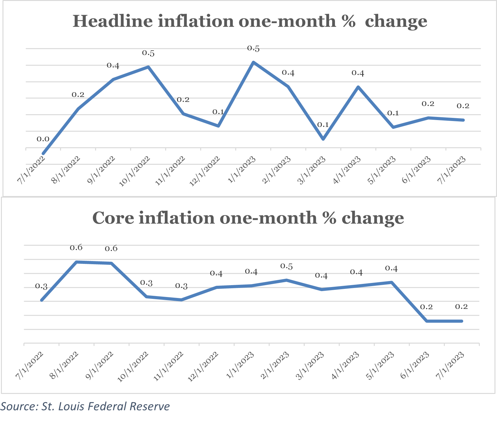
Inflation—the growth in prices—continued to ease last month. Headline inflation, which includes all items, increased just 0.2 percent month-over-month—a roughly 2.4 percent annual rate. Core inflation, which excludes food and energy prices, grew at the same monthly and annualized clips. The Federal Reserve’s preferred inflation measure, the personal consumption expenditures deflator, also rose by 0.2 percent, month-over-month.
So what’s driven the dramatical fall in inflation in the last year? The consumer price index (CPI) energy index has declined over 12 percent from a year ago, so one answer is falling energy prices. Another is supply chain normalization: the producer price index for final demand goods, which measures wholesale prices of goods purchased by businesses, has declined about 2.5 percent in the last 12 months.
CLICK ON CHART TO VIEW LARGER IMAGE
The key question for the Fed and markets is whether inflation has returned permanently to its low and stable pre-COVID state or rather has been tamed only temporarily by luck in the form of falling energy prices and easing supply chain pressures. The favorable price “shocks” of the past 12 months are unlikely to be repeated. After a rocky start to August, stock market investors appeared to conclude that the worst of inflation was indeed behind us.
Financial Markets
Stocks stumbled out of the gate in August but nearly recovered by month end.
The broad-market S&P 500 index slipped by 1.6 percent in August, trimming its year-to-date return slightly to 18.7 percent. [3] All sectors except energy stocks, buoyed in part by rising oil prices, fell during the month. [4] The S&P 500’s monthly decline was only the second of the year: the index also fell, by about 2.4 percent, in February. Pinning returns—positive or negative—on particular causes is tricky. Possibly, investors pushed stock prices lower in reaction to the largest year-over-year quarterly earnings decline since 2020. [5] An equally plausible culprit is the sharp rise in longer-term interest rates: the 10-year U.S. treasury yield, for example, rose briefly from 3.97 percent to an August high of 4.34 percent before receding. Higher rates translate into lower a “present value” for stocks, all else equal. [6]
Rising rates lower the all-else-equal prices not only of stocks, but also of bonds. The Bloomberg Aggregate index of government and investment-grade corporate bond prices dipped by 0.6 percent in August. [7] Corporate bonds generally underperformed safer treasuries during the month, and the rise in the latter helped push up the 30-year fixed rate mortgage rate in August to its highest level since the summer of 2001 before yields receded late in the month.[9] Housing starts may have jumped while permits recovered in July (reported in August), but rising mortgage rates may take a toll on already restrictive housing supply in the months ahead.
More notable than the modest decline in equity prices in the first few weeks of August was their spurt in the last few trading days of the month: at their low point, stocks had retreated nearly 5 percent since July 31. [9] Those losses were mostly erased in the final days of August, however. Ten-year U.S. treasury bond yields also pulled back from their August high (bond prices rose), ending the month only about 13 “basis points” (hundredths of a percent) higher than where they began. The catalyst seems to have been two-fold: one, a growing belief that inflation has been tamed—a debatable conclusion. And two, reassurance from the Chairman of the Fed, Jay Powell, that the Fed would further raise its policy rate only if necessary.
Economic policy
There was no Fed meeting in August, but opinions about their September meeting seemed to firm.
The Fed’s decision-making Open Market Committee (“the FOMC”) meets roughly every 6 weeks, and that can sometimes leave what feel like large time gaps between decisions. In this case, the nearly two-calendar-month period since their last meeting seems well timed: with inflation holding steady month-over-month and some evidence that the worst is behind us high, Fed officials probably need time to ponder their next move. At the beginning of August, markets assigned a roughly 82 percent chance of no change to the Fed’s policy rate, the Federal funds rate. At the end of August, odds of inaction grew to about 89 percent. [10].
While the FOMC made no formal rate decisions in August, Fed Chair Powell spoke at the annual Jackson Hole annual meeting of monetary policy makers. His speech was generally unremarkable: he reiterated the Fed’s commitment to restoring 2 percent inflation in the long run and underscored that the Fed’s target Federal funds interest rate may—or may not—have to rise further to meet this goal. Chair Powell appeared to do no harm to markets or inflation expectations with his latest remarks, but he provided no additional clarity on the Fed’s thinking, either.
We continue to feel that the Fed owes the American public a better explanation of their thought process as to what caused inflation in the first place, and why they now believe that it is mostly under control.
Article footnotes:
1 The St. Louis Federal Reserve Economic Database is the source of all economic data cited in this newsletter unless otherwise noted.
2 Source: https://www.atlantafed.org/cqer/research/gdpnow.
3 S&P 500 index return data source: https://www.spglobal.com/spdji/en/index-family/equity/us-equity/us-market-cap/#indices.
4 S&P 500 sector return data source: https://www.spglobal.com/spdji/en/research-insights/performance-reports/.
5 Source: FactSet (https://advantage.factset.com/hubfs/Website/Resources%20Section/Research%20Desk/Earnings%20Insight/EarningsInsight_080423.pdf).
6 Present value equals future value divided by a “discount rate,” where a common discount rate for U.S. stocks is the yield on a long-term U.S. treasury bond.
7 Fixed income return source: https://personal.vanguard.com/us/funds/tools/benchmarkreturns.
8 St. Louis Federal Reserve economic database.
9 S&P 500 total return price values obtained from Yahoo Finance.
10 CME FedWatch tool.
THE GREAT DISINFLATION THROUGH A JOBS-MARKET LENS
If you had told any economist two years ago that inflation could fall from 9 to 3 percent, year-over-year, with virtually no change in unemployment or meaningful slowdown in economic growth, they would have thought you were joking, or at the very least being very optimistic. [1]
But that’s what’s happened.
When inflation falls, it’s called “disinflation.” And we’ve experienced about 6 percentage points of disinflation in the last 12 months. From a peak of nearly 9 percent, headline (all items) inflation rose just 3.2 percent, year-over-year, in the 12-month period ending July 31 according to the U.S. Department of Labor. So large is the disinflation of the last year that some call it the “great disinflation.”
Everyone agrees that the great disinflation is good, perhaps great, news. But not everyone agrees on how exactly it has happened.
All Gain, No Pain
Past disinflations have been accompanied by economic pain. Economists call this pain the “sacrifice ratio.” It measures how much of loss in gross domestic product (GDP) growth or a rise in unemployment is required to get inflation down by one percentage point.
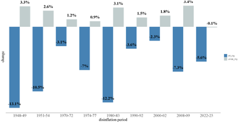
The sacrifice ratio is seen clearly in the chart below. It shows, for the largest disinflations since World War II, the change in unemployment (in gray) and the change in inflation (in blue) for each disinflation period labeled on the horizontal axis.
Typically, when inflation falls unemployment rises
Change in unemployment and inflation during major disinflations, 1948-2023
Source: Bureau of Labor Statistics
CLICK ON CHART TO VIEW LARGER IMAGE
It’s normal for unemployment to go up when inflation falls. But one disinflation in the chart above is clearly not like the others: the most recent one (on the far right). While the average increase in unemployment during disinflations is 2 percentage points, the current disinflation has witnessed (slightly) falling unemployment (!).
This is strange for two reasons. The first is that it is historically unusual, as can be seen in the chart. The second is that disinflation normally happens because the economy slows. And when this happens, unemployment rises, wage growth slows, and so therefore so do prices. Both theory and evidence point to a negative relationship between inflation and unemployment.
This is why many economists were warning of rising unemployment when the Federal Reserve (Fed) began pushing up its target interest rate in March of 2022. It’s also why economists disagree on the causes of the current disinflation—and whether it will continue.
On the one hand…
President Truman is reported to have asked for a “one-handed” economist, because his economic advisors were fond of hedging their predictions with the caveats “one the one hand” and “on other hand.” In fairness to economists, the economy is sometimes very hard to explain, never mind predict. Scholars still disagree on the causes of the great depression of the 1930s and the great inflation of the 1970s. This challenge of course applies to inflation as well.
On the one hand, some economists think inflation has fallen due to decreasing prices in inputs of companies. These fortunate so-called “supply shocks” include declining energy prices and the gradual normalization of “supply chain” conditions.
On the other hand, some researchers prefer to focus on a gradual loosening of the labor market, which results in lower wage increase demands by workers, which reduces upward pressure on prices, and so on in a virtuous, deflationary cycle. Since we talked about supply chain and falling energy price explanations for disinflation last month (please contact us if you’d like another copy of that newsletter), in the rest of this article, we take up the labor-market explanation for the great disinflation.
Finding a Better Pressure Measure
Economists like to give names to relationships, and the negative relationship between inflation and unemployment seen in the chart above is called the “Phillips curve” after the economist who first identified it. Why a curve? Because, when plotted and estimated, pairs of unemployment and inflation (or the change in inflation) often—but not always—form a downward sloping curve. The actual relationship is more complex and sometimes disappears entirely. This is part of what makes predicting inflation using unemployment hard.
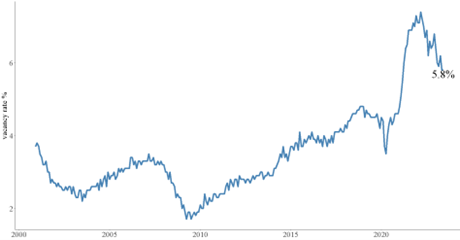
Since unemployment hasn’t budged during the current disinflation, we have to look to labor market measures other than those captured in a traditional Phillips curve for answers. One favorite candidate is not the unemployment rate, but the vacancy rate. The vacancy rate is the number of positions business are looking to fill (vacancies) divided by the civilian labor force. As shown in the chart below, it has declined significantly from a high of about 7.5 percent in March 2022 to under 6 percent today. Though it is still elevated, its fall has been sharp—and it coincides with the great disinflation.
The vacancy rate has fallen significantly
Source: Bureau of Labor Statistics
CLICK ON CHART TO VIEW LARGER IMAGE
The falling vacancy rate got economist’s attention for more reasons than that it happened alongside falling inflation. There’s a theoretical relationship between vacancies and the unemployment rate that makes the former a good predictor of just how hot the labor market is. And of course that relationship was also given a name. It’s called the Beveridge curve, after its discoverer.
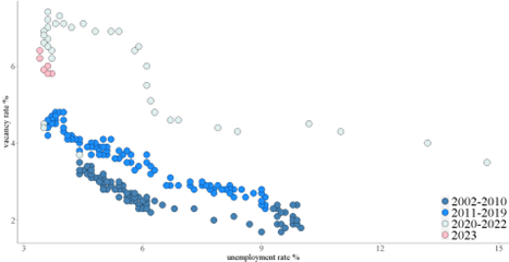
The Beveridge curve relates the vacancy rate, shown above, to the unemployment rate. To construct a Beveridge curve requires pairs of vacancy and unemployment rates. These are shown as dots in the chart below, filled with colors denoting three-different time periods since the year 2000. Beveridge curves tend to slope downward, as in the chart. This is because more job postings (higher vacancy rates) happen during periods of low unemployment—it gets harder for firms to fill jobs when the labor market is tight. Importantly, the Beveridge curve has shifted over time. In the 2000s, there were fewer vacancies per unemployed person than in the 2010s. And something dramatic happened after COVID (the gray dots).
Shifts in the Beveridge curve reflect changes in the ease of matching workers with jobs
Source: Bureau of Labor Statistics
CLICK ON CHART TO VIEW LARGER IMAGE
The Beveridge shifted out and up sharply in 2020—the gray dots are farther up and to the right than the dark and light blue dots. This is because it became harder for employers to match openings with unemployed people after COVID. And to some researchers, it explains the surge in wages and thus inflation after COVID.
But in 2023, the Beveridge curve appeared to be shifting again. The pink dots are vacancy rate – unemployment rate pairs so far in 2023 (through July). Notice that they’re closer to the origin (lower and more leftward) than the gray dots. Some researchers believe that the Beveridge curve is shifting back inward as it becomes easier for employers to fill open positions as the economy continues to normalize post-COVID. If so, this may help explain the great disinflation. And if these dots continue to trace out a lower Beveridge curve than the gray dots do, disinflation may continue.
Keep an Eye on the Curve
The great disinflation of 2022-23 is a historical anomaly. Price growth has come down, but unemployment hasn’t gone up. This is less of a mystery if your labor-market measure is vacancies rather than unemployment. Job openings have declined significantly in the last year. And their relationship with unemployment has shifted—unemployment-vacancy rate pairs, when graphed, are shifting inward. Said differently, the Beveridge curve is becoming more favorable.
The tight labor market may have helped cause inflation to jump in the first place. If so, then improved job-matching reflected by an inwardly shifting Beveridge curve may be the key to restoring inflation normalcy.
Article footnotes:
1 The St. Louis Federal Reserve Economic Database is the source of all economic data cited in this article.
HOME PRICES AND MORTGAGE RATES
In the twelve months ending June 30, the interest rate on a 30-year fixed-rate mortgage has increased from 5.7 to 6.7 percent. [1] Over the same period, the median sales price for new houses sold in the U.S. fell from $432,700 to $415,400, a 4 percent decline. This reinforces the popular belief that rising interest rates are “bad” for home prices—when rates go up, home prices can come down.
This belief has a grain of truth at its core. Rising rates result in higher monthly payments. And these result in lower housing affordability, lower demand, and—all else equal—falling prices.
But all else is almost never equal. Whether rising interest rates represent a serious headwind for home prices depends on what’s going on elsewhere in the economy.
Rates and affordability
About a year ago, the monthly payment on a 30-year fixed-rate mortgage for a $500,000 home bought with 20% down was about $2,300. Today, under identical terms, the monthly payment is roughly $2,600—that’s $300 more, or about 12 percent more than a year ago (including inflation). Over the same period, average hourly earnings rose only 4.4 percent (again, including inflation). Monthly payments on long-term mortgages are therefore rising much faster than average earnings.
By this simple measure, home affordability is falling. And falling affordability can put downward pressure on prices. Indeed, prices did fall in the second half of last year. But that’s not the end of the story. By widely followed national measures home prices have since mostly or entirely recovered. [2]
This bounce back, despite ongoing elevated mortgage rates, suggests that home prices depend on more than mortgage rates. That there’s more to the story can be seen by examining the direction of mortgage rate changes and home price changes since 2000.
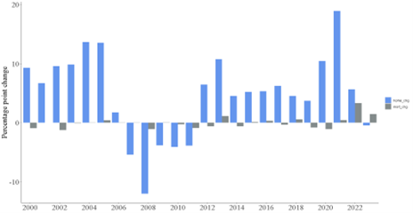
As shown in the chart below, in the 23 years since 2000 including the current year through July 31, home prices (the blue bars) frequently go up despite rising mortgage rates (the gray bars). Economic growth lifts both. .
Home prices (the blue bars) have gone up in 16 of 24 years (including 2023) since 2000. In half of those periods, mortgage rates (the gray bars) were also rising.
Source: S&P Case Shiller home price index, Freddie Mac
CLICK ON CHART TO VIEW LARGER IMAGE
A Strong Economy Trumps Higher Rates
A mortgage is a long-term obligation. As such it requires confidence on the part of the borrower that they’ll remain employed—and perhaps even experience income gains over time. A strong economy and the income growth and asset appreciation that usually go along with it can increase borrowers’ willingness to take on debt and lenders’ willingness to extend credit. This usually pushes up interest rates as the demand for loans of all types increases. Thus, in a strong economy, interest rates, including rates on mortgages, can move in tandem with home prices.
This fact may go a long way to explaining how it is that home prices have managed to recover in the last despite rising mortgage rates: steady economic growth is supporting both prices and elevated rates.
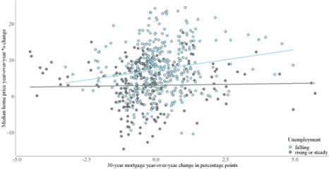
The chart below is a more analytical way to show that home prices can rise even in the face of rising mortgage rates if economic conditions are strong. Each dot in the chart is a pair of 12-month changes in the 30-year fixed-rate mortgage and the percentage increase or decrease in the median sales price in two environments. The first is when unemployment is falling (the light-blue dots) and the second is when it is flat or rising (the gray dots). When unemployment is falling, the economy is generally growing and home prices are generally rising. This is illustrated by the blue line which shows the relationship (formally, the “correlation”) between changes in mortgage rates and home prices when unemployment is falling: it points up, indicating positive correlation. Conversely, when unemployment is rising (or flat), there’s no relationship between home price changes and mortgage rate changes. In this case, the gray line is flat, indicating no correlation.
12-month changes in mortgage rates and home prices, 1971-2023
Source: Freddie ac & U.S. Bureau of Labor Statistics
CLICK ON CHART TO VIEW LARGER IMAGE
A Good Problem to Have
Rising interest rates sparked fears of a home prices downturn. And in fact, home prices did retreat in the second half of 2022 as mortgage rates rose. But they’ve since rebounded despite ongoing, elevated mortgage rates. This episode shows that home prices and mortgage rates sometimes move in the same direction in response to broader economic currents: strong growth can lift both, and weak growth can do the opposite. To the extent that rising interest rates are a byproduct of a robust economy characterized by rising asset—including home—prices, they’re a good problem to have.
Article footnotes:
1 Interest rate, mortgage rate, and home price data cited in this article are obtained from the St. Louis Federal Reserve online database unless otherwise noted.
2 The Case-Shiller National Home Price index and Zillow Home Value index are at 99 percent and 101 percent of their June 2022 levels, respectively.
Delivered to your inbox.
We aim to release two newsletters a month, one focused on financial planning and another on investing. If you are interested in having our monthly newsletters delivered directly to your email inbox, choose what topic you prefer and submit this form. Thank you for your interest in our newsletters.
SCHEDULE A MEETING
With all that is going on in markets and the economy, you might want a second set of eyes on your financial plan, or maybe you need to build a financial plan for the first time. Either way, our advisors are available throughout New England, and we are happy to schedule a time to meet. If you’d like to set up an appointment, click here, or call us at 800-393-4001 to schedule your meeting.
Our mailing address is:
144 Gould Street, Suite 210
Needham, MA 02494
The opinions and forecasts expressed are those of the author, and may not actually come to pass. This information is subject to change at any time, based on market and other conditions and should not be construed as a recommendation of any specific security or investment plan. Past performance does not guarantee future results.
Armstrong Advisory Group, Inc. does not offer tax or legal advice and no portion of this communication should be interpreted as legal or accounting advice. You are strongly encouraged to seek advice from qualified tax and/or legal experts regarding any tax or legal matters relevant to you.
ARMSTRONG ADVISORY GROUP, INC. – SEC REGISTERED INVESTMENT ADVISER
The information contained herein, including any expression of opinion, has been obtained from or is based upon, sources believed to be reliable, but is not guaranteed as to accuracy or completeness. This is not intended to be an offer to buy, sell or hold or a solicitation of an offer to buy, hold or sell the securities, if any referred to herein.
All investments involve the risk of potential investment losses. An investor cannot invest directly in an index. Diversification seeks to reduce the volatility of a portfolio by investing in a variety of asset classes. Neither asset allocation nor diversification guarantees against market loss or greater or more consistent returns. Bonds are subject to interest rate risk and if sold or redeemed prior to maturity, may be subject to additional gain or loss. Armstrong Advisory does not provide any tax or legal advice; please consult with your tax and legal advisers on such matters.

