Investing Newsletter 6.23
May 2023 economic, market and policy update
The economy
In May, unemployment stayed unusually low while inflation stayed high, exactly as economic theory predicts. At the same time, signs emerged of slowing economic growth.
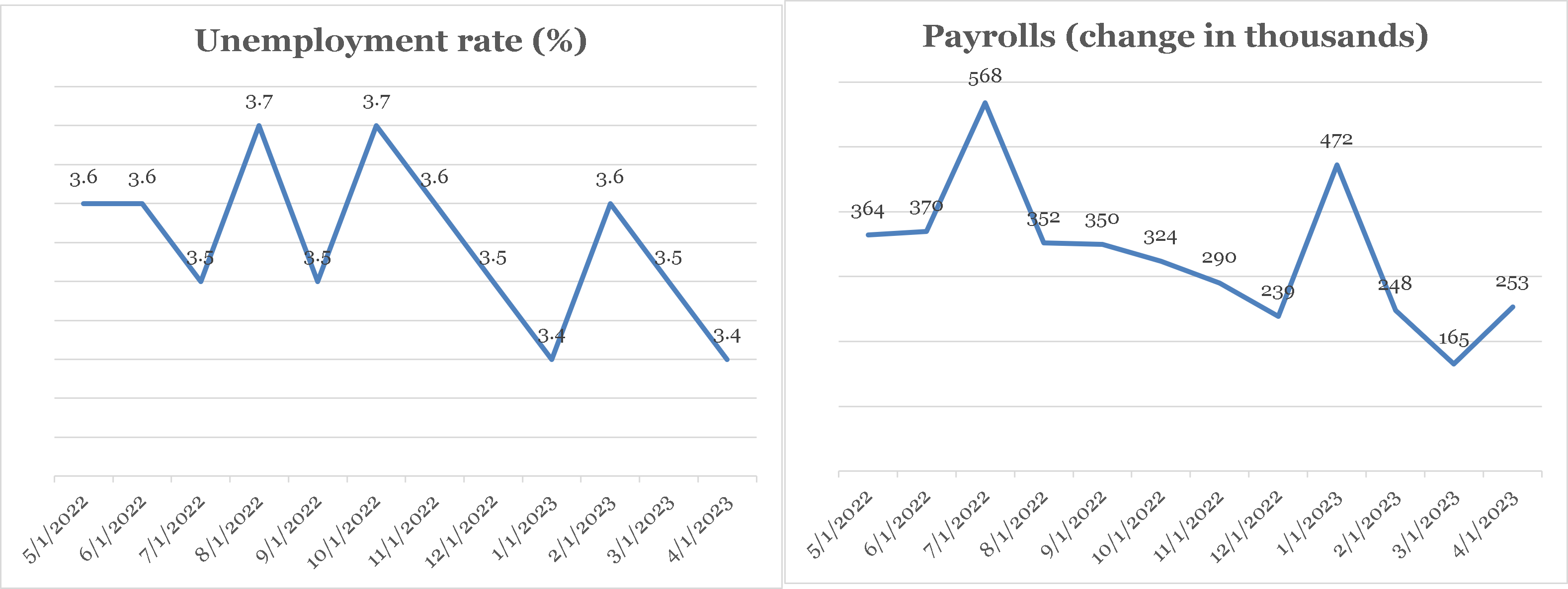
The unemployment rate, 3.4 percent, has been less than 4 percent for the past 15 months—something that hasn’t happened since the late 1960s. And new jobs (payrolls) remain robust relative to the number of available workers. By any measure, including job openings (vacancies) which hit a two year low in March (reported in early May) but rebounded somewhat in April (reported in late May), jobs are plentiful and workers are in demand. [1]
Unemployment fell to 3.4 percent in May, the lowest since 1969, while payroll ticked up from the (downwardly revised) prior month.
Source: St. Louis Federal Reserve
CLICK ON CHART TO VIEW LARGER IMAGE
Wage growth confirms that the labor market is hot. Average hourly earnings sprung back up to about 0.5 percent (all percentage changes are month-over-month unless otherwise noted), a greater than 6 percent annual rate. Because rising earnings are typically passed on by companies to consumers, this estimate—if not revised—helps explain why inflation stayed high in April.
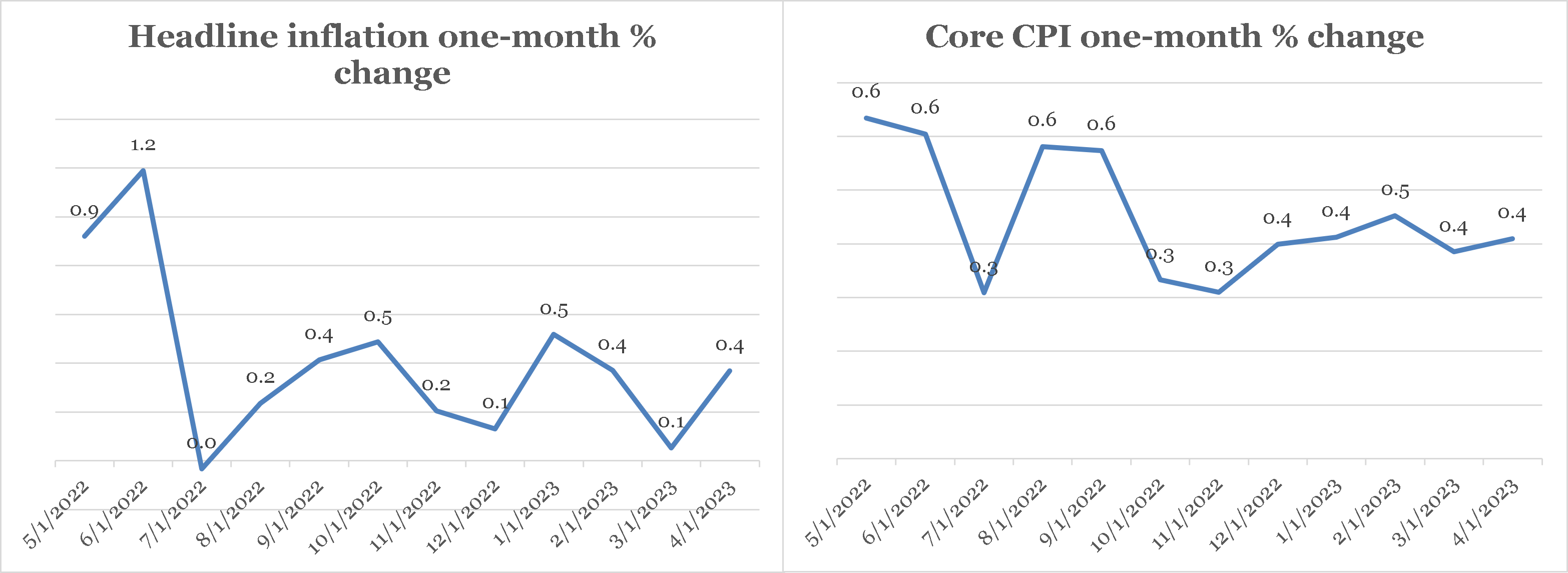
Headline consumer price index (CPI) inflation, or the price change in all goods and services, rose by 0.4 percent in April (reported in May), an increase from the prior rate of 0.1 percent. “Core” CPI inflation, which excludes food and energy because their large swings can distort the true inflation picture, also rose 0.4 percent. There are in fact many ways to measure inflation. While the CPI is perhaps the most familiar, the personal consumption expenditures (PCE) “deflator” is the Federal Reserve’s measure of choice. And coincidentally, the PCE’s headline and core deflators also rose 0.4 percent in April. Thus, both the CPI and PCE deflator point to ongoing headline and core inflation in the 4-or-so annual percent range.
While four-or-so percent is a big improvement from last year at this time, 4 percent annual inflation is way above the Federal Reserve’s target of 2 percent per year.
Headline and core inflation both rose at nearly 5 percent annual rate in April (reported in May).
Source: St. Louis Federal Reserve
CLICK ON CHART TO VIEW LARGER IMAGE
Many researchers believe that inflation is due in large part to too much demand. If this is the case, then sputtering retail sales suggest that Fed interest rate increases are beginning to slow demand.
Advance retail sales rose 0.4 percent in April, the same as inflation—meaning real (after-inflation) spending was flat for the month.
This follows two months of outright declines in spending and brought the year-over-year increase down to 0.5 percent, down from over 7.6 percent the previous year. And while housing starts rebounded in April (+2.2 percent), permits declined for the 9th month in the last 12.
Overall, the latest economic data points to a potentially slowing economy with uncomfortably high inflation, despite a slowdown in price growth. And this was probably on the minds of both equity and fixed income investors in May.
Financial markets
Stock daily price changes were more subdued than usual in May—that is, swings were lower than the average of the prior 12 months— despite persistent inflation and debt-ceiling drama (see below). The S&P 500 index of leading U.S. companies rose about 0.4 percent. But just beneath the relatively calm surface, market conditions were turbulent. “Growth” sectors, like technology and communications, were buoyant (up 9.5 and 6.2 percent, respectively), with tech company shares propelled by enthusiasm about the prospects of artificial intelligence.
Foreign companies (the MSCI EAFE index) were the best performers among major asset classes (left panel), while utilities and consumer staples stocks led U.S. markets (right panel)
Source: Data provided by Russell Investments, Morgan Stanley Capital International, Bloomberg, and Standard & Poor’s returns calculated by YCharts.
CLICK ON CHART TO VIEW LARGER IMAGE
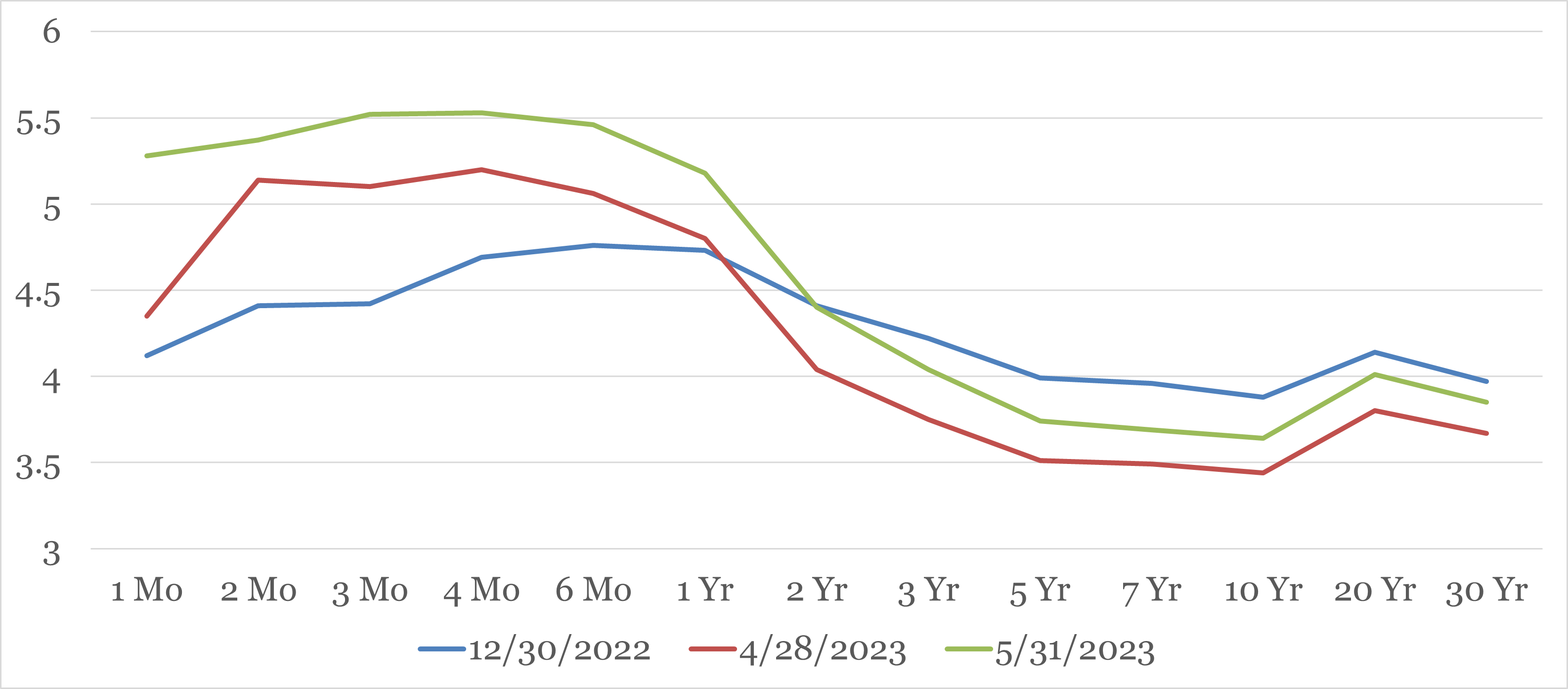
But rising interest rates—the 10-year U.S. treasury yield increased to 3.7 on May 31 from a low of 3.3 percent on May 4—dogged rate-sensitive sectors like real estate and utilities (down 4.5 and 5.9 percent, respectively), which were among the worst performing major segments in May.
Short-term treasury yields rose in May, while longer-term yields fell
Source: U.S. Treasury
CLICK ON CHART TO VIEW LARGER IMAGE
Longer term rates rose as well, though less dramatically. It’s hard to say whether this was due to related concerns—though this doesn’t seem plausible given the lack of movement in the middle of the curve, or to lingering inflation worries, or a combination of the latter and other factors.
Overall, the movement in interest rates caused the Bloomberg Aggregate bond index to fall by 1.1 percent, since for bond yields to rise, their prices must fall. What is certain is that rising rates make it more expensive for the U.S. government to borrow, and this slow-rolling potential crisis is at the root of the debt ceiling wrangling between the Biden Administration and the Republican-controlled House of Representatives.
Economic Policy
The U.S. Treasury is by law permitted to issue only a certain amount of debt. That “debt ceiling” is $31.4 trillion, and it was reached earlier this year. Since then, receipts from taxes, tariffs, fees, etc. as well as accounting tricks have allowed government spending to continue at levels approved by the last Congress.
In the final week of May, the Biden Administration came to an agreement with the Republican leadership in the House of Representatives to raise the debt ceiling in exchange for a cap on some forms of government spending, making some forms of government assistance contingent on employment, and other concessions.
At the time of this writing, the agreement had yet to be voted upon by the Congress. The U.S. Treasury expects to run out of ways to maintain previously determined spending levels without new borrowing by sometime in early June (the “x” date). At that point, if the agreement hasn’t been approved, Federal spending must be cut to equal Federal revenue. This cut will reduce overall demand and, if not reversed quickly, could dent short-run economic growth.
As an investment advisor, our focus is on what the unlikely failure of Congress to pass the debt-ceiling agreement would mean for capital markets. Some predict massive declines in stocks and bonds. [2] Our view is more nuanced. Passing the x-date without Congressional approval of the debt-ceiling agreement could indeed shake markets—stocks and bonds might both drop sharply. But the damage would probably be short-lived if the deal is approved quickly. A similar panic sell-off followed by relief rally followed the failure then passage of bank bailout legislation during the depths of the financial crisis of 2008-9. A brief market quake could be just what legislators and the Administration motivate them to accept the compromise reached by the Biden Administration and Republican leadership.
Of course, none of this self-inflicted market volatility makes the Federal Reserve’s (Fed’s) inflation-fighting task any simpler. Inflation, which the Fed controls in the long run, has slowed as noted in the first section. But, as also noted, it remains well above the Fed’s stated 2 percent per year goal. Thus, the Fed continued to raise its short-term policy rate target (the “Fed funds” rate”) in May by increasing its target by 0.25 percent to 5 percent. The Fed’s policy-making committee meets again in mid-June, and “futures” markets currently put the chances of another 0.25 percent increase (to 5.25 percent) at about 60 percent. [3]
Whether this will be enough to not only halt but also reduce inflation growth depends on an imaginary construct economists call the “neutral” rate of interest. As the name suggests, the neutral rate is the level of Fed Funds that keeps inflation steady. With Fed funds now at 5 percent and expected inflation somewhere around 4 percent, the real (after expected inflation) Fed funds rate is about 1 percent. If that’s more than the neutral rate, inflation should continue to come down all else equal. If it’s less, inflation could stay stuck at an unacceptably high rate. Unfortunately, we won’t know whether the Fed has done enough for several months. Given inflation’s tenacity, the Fed may have to hike rates once or twice more.
Article endnotes appear at bottom of newsletter.
THE FEDERAL DEBT
The national debt, or the total amount of outstanding loans made by investors to the U.S. government, stands at about $31 trillion as of the end of 2022. [4]
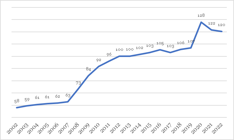
Twenty years prior (2002), the debt stood at $6.4 trillion. Thus, the national debt has grown at a rate of over 8.2 percent per year since 2002, about the same as the 20 years before that. But while the growth rate of debt in the last two decades isn’t unprecedented, it’s level certainly is.
The ever-growing U. S. Debt
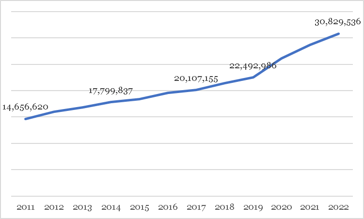
In each of Bill Clinton’s final three years as president (he left office in January 2001), the Federal budget was in surplus. But it’s been a sea of red ink ever since, and the national debt has ballooned as a result. And it’s getting worse: the debt’s growth rate has sped up in the last few years—notice how the blue line in the chart below gets steeper (goes up faster) around 2019. At its current rate of increase, our national debt will double every 8.7-or-so years. The Congressional Budget Office (CBO) expects budget deficits, or the addition to the national debt, to average nearly $2 trillion each year over the next 10 years. [5] Bad as this forecast may seem, this prediction is optimistic compared to the growth rate of the last 20 years!
The Federal Debt has more than doubled in the last dozen years
Source: U.S. Treasury
CLICK ON CHART TO VIEW LARGER IMAGE
The national debt has pros and cons
Debt isn’t inherently bad. In every major war from the Revolution to World War II, the U.S. government went heavily into debt. Few would argue that those “investments” weren’t worthwhile—they helped to lay the foundation for peace, and future growth. They were investments.
And those investments allowed the Federal government to pay down its debt quickly, since the real (after-inflation) economy generally expanded more quickly than the real value of outstanding debt. This is a crucial point: as long as economic growth is sufficiently fast compared to the growth in debt, that debt is manageable because it gets smaller relative to the size of the economy. Much like when a young family takes on a home mortgage, servicing debt gets “cheaper” as that family’s income grows over time.
Recently, however, economic growth has shrunk while the debt has grown. In the 20 years up to 2001, real gross domestic product (GDP) grew by 3.2 percent each year, but between 2002 and 2021, it grew by only 1.8 percent per year.
The chart below shows the resulting rise in debt as a percentage of GDP. A steep upward trend is clear. We are not outgrowing our debt. A steep upward trend is also unsustainable. A debt that grows as a percentage of GDP will eat up an increasing amount of national income in repayments, all else equal. And this will take away from spending in other, potentially vital areas (e.g., defense spending).
Federal debt as a percentage of GDP has reached levels typically seen only in wartime
Source: U.S. Treasury
CLICK ON CHART TO VIEW LARGER IMAGE
But that’s not the only way that chronic government budget shortfalls can harm an economy. Another, related, way is through “crowding out” private investment. This happens when government debt, which takes the form of bond issuance, soaks up savings that would otherwise find its way into private debt and other assets. Though hard to quantify, most economists agree that all else equal, government borrowing puts upward pressure on interest rates by increasing the supply of bonds available to investors. This in turn raises the cost of capital for everyone from companies to homeowners with a mortgage to consumers using credit cards. In the end, higher government borrowing results in less investment today, and less consumption tomorrow, all else equal.
Foreign savers finance our big-spending ways
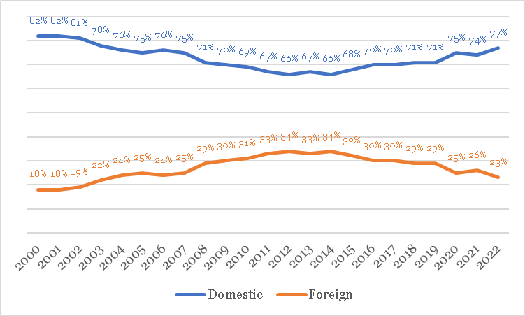
The last point raises a question: does foreign ownership of debt—a controversial subject—mitigate “crowding out”? Yes, it does. The chart below shows that foreign savers—including foreign central banks, companies, and individuals—own about 22 percent of the Federal debt today, down from a high of 34 percent about 10 years ago but little changed, on average, over the last 20 years. In fact, one of the reasons why U.S. interest rates have been relatively low despite the run up in the national debt over the last 20 years is demand for U.S. government bonds from foreign savers. [6]
Domestic (blue) and foreign (orange) ownership of U.S. debt percentages have been steady
Source: U.S. Treasury
CLICK ON CHART TO VIEW LARGER IMAGE
It undoubtedly makes many Americans uncomfortable that an unfriendly power like China owns over 10 percent of our national debt, making it the second-largest foreign holder of U.S. government bonds next to Japan—the United Kingdom is a distant third. But at the same time, China’s appetite for U.S. government debt has made spending beyond our means possible. And, contrary to the worries of some, China is unlikely to “fire sale” its holdings of U.S. treasuries out of spite since to do so would result in large, self-inflicted losses. As long as we continue to issue large amounts of debt, foreign entities seeking dollar-based investments will buy it.
There are limits to a country’s ability to borrow
Debt can finance investments that increase future growth and raise the standard of living of our children and their children. But debt can also be used to finance wasteful spending or short-sighted stimulus payments, forcing future generations to pay for our inability to curb either government spending or our own. Additionally, it can “crowd out” current investment by soaking up savings, which will likely harm future growth.
The U.S. national debt has more than doubled as a percentage of GDP since 2000 and continues to climb. Failure to reduce its rate of growth is likely to mean higher interest rates, lower economic growth rates, and lower standard of living growth.
Article endnotes appear at bottom of newsletter.
Stocks are for Growth, Bonds are for Protection
Last year, as interest rates rose, the treasury bond market as proxied by the Bloomberg Treasury index fell by 12.5 percent (since bond prices fall when interest rates rise). In the same timeframe, the broad U.S. stock market as proxied by the S&P 500 index dropped by 18.1 percent.
When stocks go down, treasury bonds—the highest quality of all fixed-income investments—are supposed to go up. For a diversified investor who owns both stocks and bonds, their simultaneous fall was surprising and disappointing.
Does this mean that balanced investing no longer “works”? For reasons we explain below, we think the answer to this question is likely “no.”
Why diversified portfolios hold bonds
Different investments serve different roles in a diversified portfolio. Stocks represent ownership in publicly traded companies. This entitles stockholders to a share of a company’s profits. Sometimes, this share comes in the form of a dividend. It can also come from the appreciation (growth) that may occur after a company makes investments that increase future profits. Stocks prices are therefore sensitive to the state of the overall economy: all else equal, a growing economy is good for stocks. Because economic growth tends to increase over time, stocks are a powerful long-run wealth-generating machine for investors.
But economic growth stalls or even reverses from time to time. And these economic slowdowns tend to weigh on stock returns. For this reason, an investment that behaves differently than stocks when growth inevitably stalls is valuable. Treasury bonds (treasuries), which are backed by the “full faith and credit” of the U.S. government, are just such an investment. Treasuries are a type of insurance against wild stock-market movements—that is, they insure a diversified portfolio against extreme stock-market risk.
The practical case for portfolio insurance
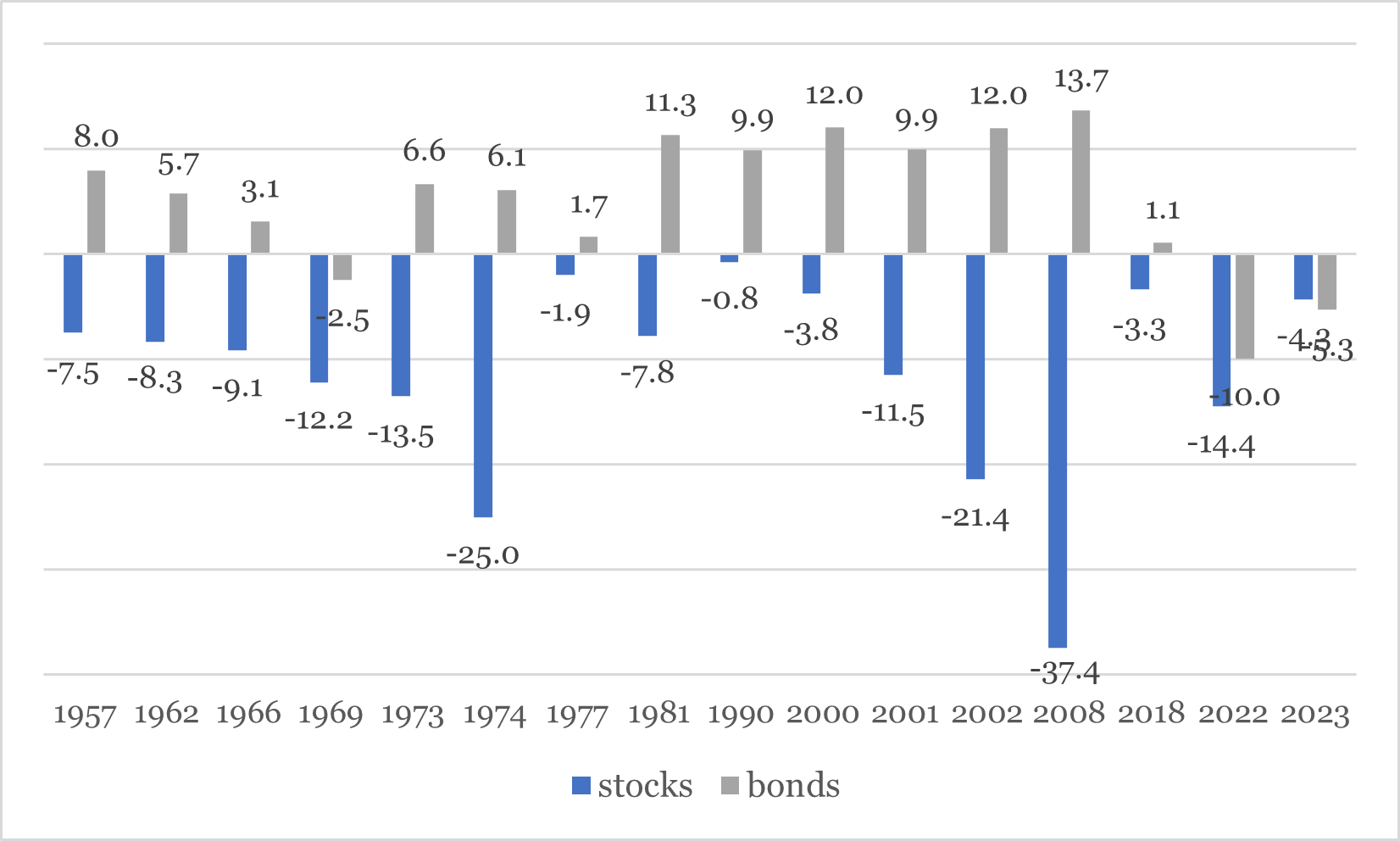
The insurance value of government bonds—a broader category of U.S. government-backed fixed income investments that includes treasuries as well as government-backed mortgage bonds— is best illustrated by periods when stocks performed poorly. The chart below, which uses different definitions of large-company stock and bond returns than elsewhere in this article for a longer timeframe of analysis, shows 16 periods when stock returns (the blue bars) were negative in the 12 months prior, labeled by the year in which they happened (on the horizontal axis). With one exception, 1969, negative 12-month stock returns were always accompanied by positive—strongly positive, in fact—returns for intermediate term government bonds (the gray bars), until 2022.
When large-cap stocks go down (blue bars) government bonds (gray bars) almost always go up
Source: Morningstar
CLICK ON CHART TO VIEW LARGER IMAGE
Using a wider lens, from 1926 to 2022 the average return on intermediate-term government bonds in years when large U.S. company stocks were down was 7.4 percent. [7]
But averages can mislead: this relationship doesn’t always hold, and it varies in magnitude. To get a better feel for the typical relationship between stocks and bonds, a different measure— “correlation”—helps.
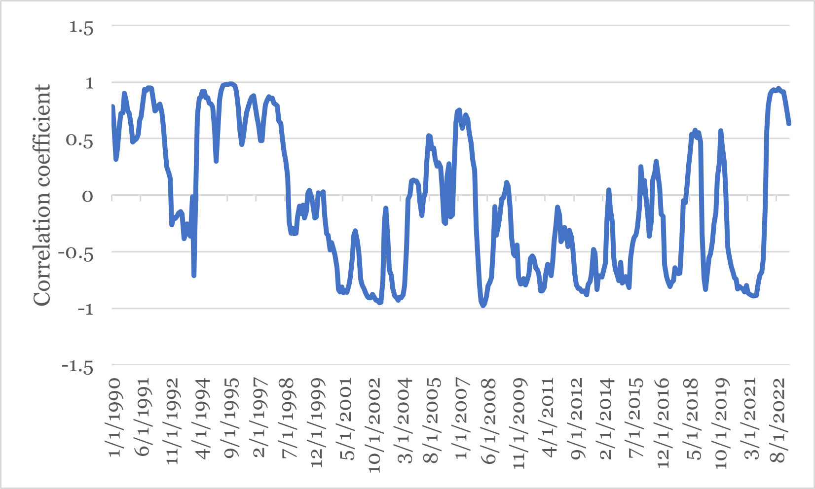
Correlation measures the degree to which two things move together—or don’t. It falls between minus 1 (perfect opposite movement) and plus 1 (perfect correspondence). For example, hot weather and ice cream sales are highly correlated while cold weather and beach traffic aren’t. The chart below shows the rolling 12-month correlation between large U.S. company stocks and intermediate-term U.S. government bonds.
The correlation between stocks and bonds has varied over time
Source: Morningstar
CLICK ON CHART TO VIEW LARGER IMAGE
As the chart shows, government bonds and stocks sometimes moved together: in certain periods, their correlation was not only positive, but close to 1. This happened when the blue line was above zero (measured on the vertical axis). At other times, however, bonds and stocks moved in opposite directions: their correlation of nearly negative 1. This happened when the blue line was below zero.
During most of the 1990s, stocks and bonds moved together positively: when one went up, so did the other. This is because, for deeper economic reasons, interest rates fell and stock prices rose steadily throughout that decade. Whereas in the first half of the 2010s, when stocks went up, bonds went down and vice versa.
On average, however, stocks and bonds exhibit low-to-negative correlation—when one went up, the other went down. And this makes sense: speculators tend to sell stocks when economic growth prospects sour, and these same conditions tend to increase demand for safer bonds. This is why government bonds can be thought of as a type of “insurance” against extreme stock market swings.
Insurance isn’t free
As noted, bonds are insurance against stock market turmoil. And of course, insurance isn’t free. The cost of stock-market insurance in the form of bonds is lower overall returns.
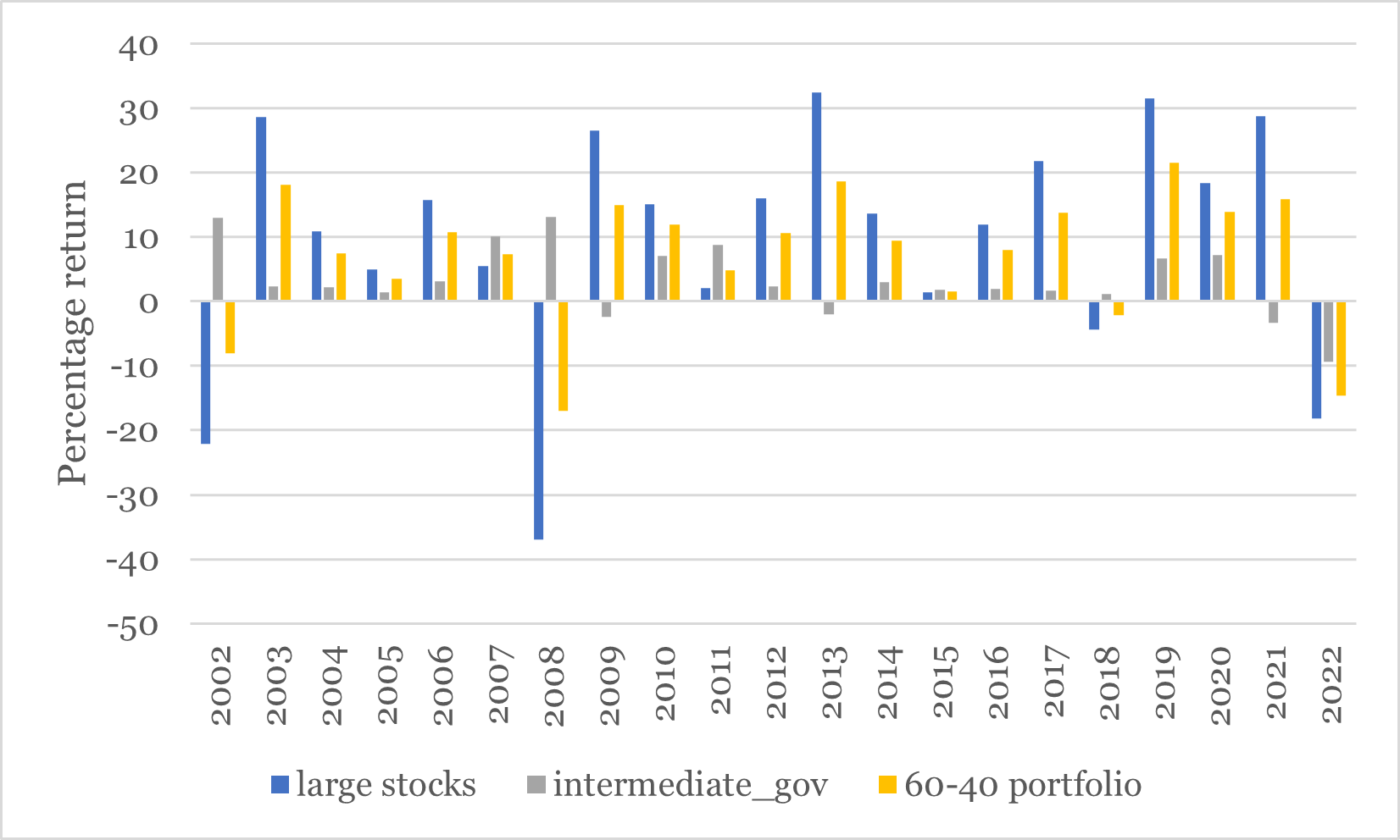
The chart below shows the returns of the Morningstar large cap stock index (blue bars), the Morningstar intermediate-term government bond index (the gray bars) and a diversified, “balanced” portfolio” made up of a 60 percent / 40 percent combination of the two indexes (the gold bars). The balanced portfolio rarely “wins”: the height of the gold bars is usually between the blue and gray bars, but it performs respectably.
While the average return for stocks during the period shown was 9.7 percent and the average return for bonds 3.3 percent, the average return for the balanced portfolio was about 7.1 percent. And importantly, the risk as measured by standard deviation of the bond portfolio was far less—10.1 percent versus 17.8 percent—for the balanced portfolio than for the stock portfolio.
The returns to a diversified mix were lower—this is the cost of bonds—but so was the risk.
Source: Morningstar
CLICK ON CHART TO VIEW LARGER IMAGE
Bonds can help get you to your destination with less risk
Here’s another way to think about the role of bonds in a diversified portfolio. If your investment portfolio was a car, stocks would be the engine and bonds would be the brakes. Stocks power your portfolio, and ultimately get you to your wealth “destination.” Bonds help you avoid portfolio “accidents” by moderating the unpredictable but inevitable swings in stocks. The cost of your brakes is lower average speed—lower returns in this analogy. But the benefit is that you get to your wealth destination in one piece and with acceptable risk.
Newsletter endnotes:
1 https://www.cnbc.com/2023/04/18/public-pessimism-on-the-economy-hits-a-new-high-cnbc-survey-shows.html
2 Economic data referenced in this newsletter retrieved from the St. Louis Federal Reserve online database.
3 Financial market data and capital market returns referenced in this newsletter retrieved from YCharts.
4 U.S. Treasury.
5 Congressional Budget Office.
6 Source: Bernanke, Ben. 2015. The Global Savings Glut. Brookings Institution. https://www.brookings.edu/blog/ben-bernanke/2015/04/01/why-are-interest-rates-so-low-part-3-the-global-savings-glut/
7 Source: AAG calculations using Morningstar return data
SCHEDULE A MEETING
With all that is going on in markets and the economy, you might want a second set of eyes on your financial plan, or maybe you need to build a financial plan for the first time. Either way, our advisors are available throughout New England, and we are happy to schedule a time to meet. If you’d like to set up an appointment, click here, or call us at 800-393-4001 to schedule your meeting.
Delivered to your inbox.
We aim to release two newsletters a month, one focused on financial planning and another on investing. If you are interested in having our monthly newsletters delivered directly to your email inbox, choose what topic you prefer and submit this form. Thank you for your interest in our newsletters.
Our mailing address is:
144 Gould Street, Suite 210
Needham, MA 02494
The opinions and forecasts expressed are those of the author, and may not actually come to pass. This information is subject to change at any time, based on market and other conditions and should not be construed as a recommendation of any specific security or investment plan. Past performance does not guarantee future results.
Armstrong Advisory Group, Inc. does not offer tax or legal advice and no portion of this communication should be interpreted as legal or accounting advice. You are strongly encouraged to seek advice from qualified tax and/or legal experts regarding any tax or legal matters relevant to you.
ARMSTRONG ADVISORY GROUP, INC. – SEC REGISTERED INVESTMENT ADVISER
The information contained herein, including any expression of opinion, has been obtained from or is based upon, sources believed to be reliable, but is not guaranteed as to accuracy or completeness. This is not intended to be an offer to buy, sell or hold or a solicitation of an offer to buy, hold or sell the securities, if any referred to herein.
All investments involve the risk of potential investment losses. An investor cannot invest directly in an index. Diversification seeks to reduce the volatility of a portfolio by investing in a variety of asset classes. Neither asset allocation nor diversification guarantees against market loss or greater or more consistent returns. Bonds are subject to interest rate risk and if sold or redeemed prior to maturity, may be subject to additional gain or loss. Armstrong Advisory does not provide any tax or legal advice; please consult with your tax and legal advisers on such matters.

